
Camden Town Beer Font
Brief: Design a new beer font tower that fits in with Camden Hells ‘fresh’ positioning in the market.
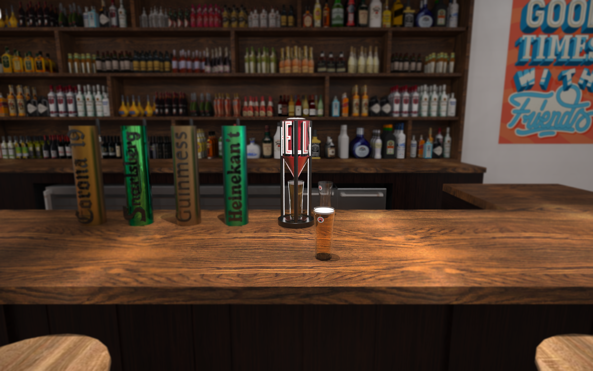
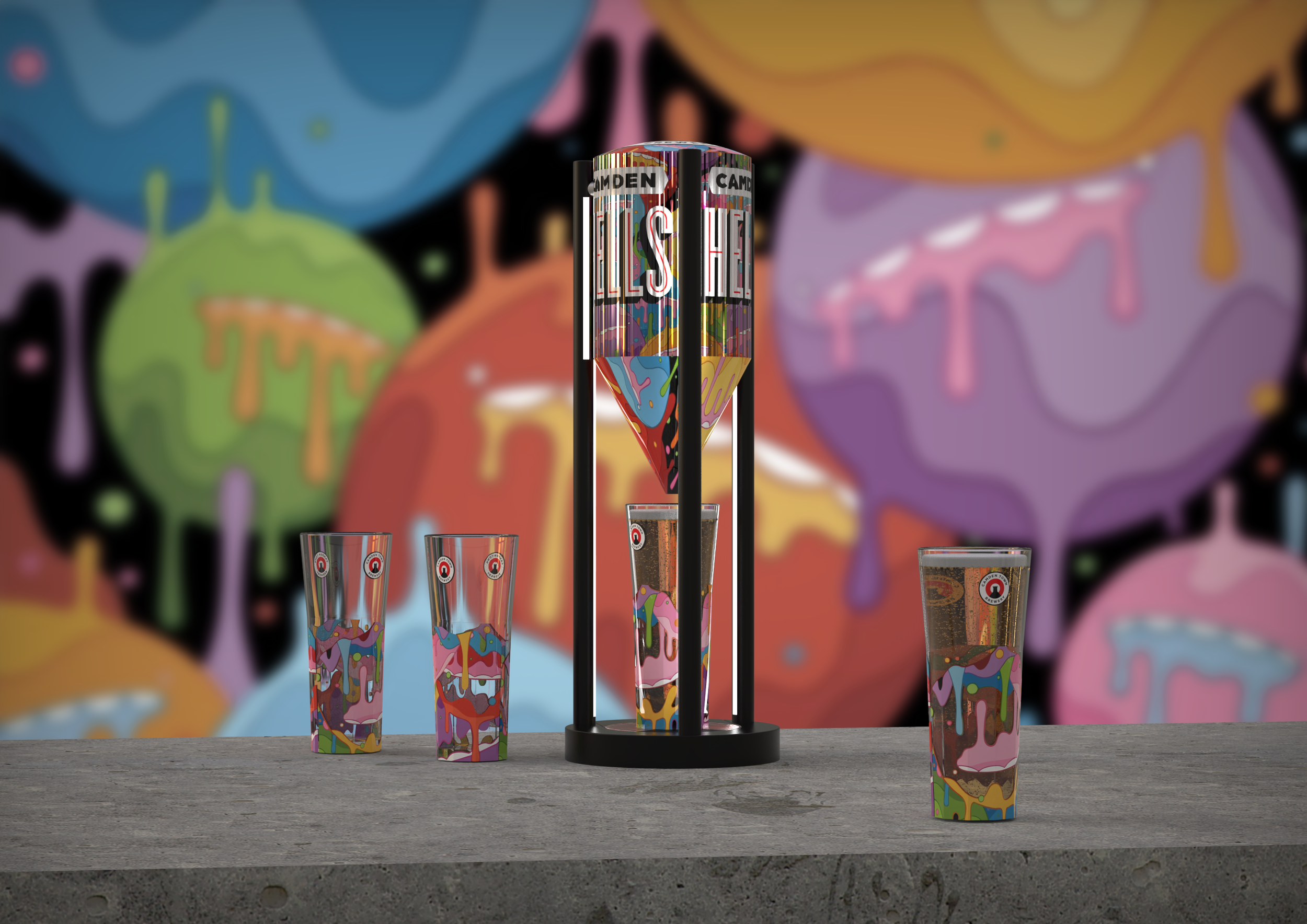
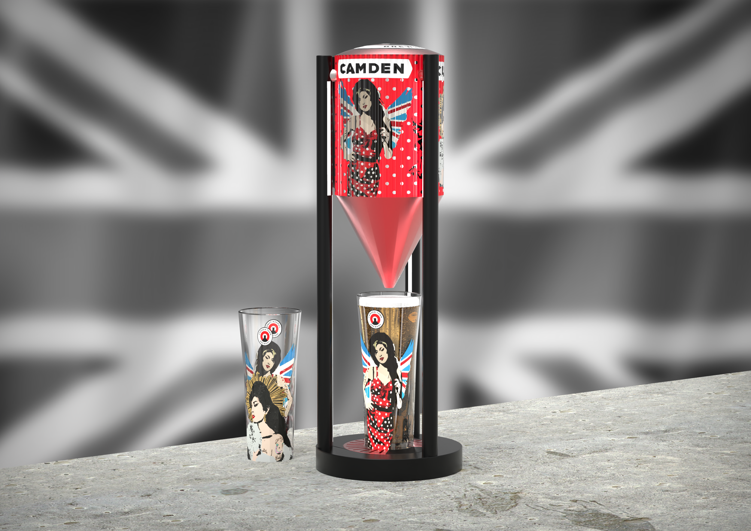
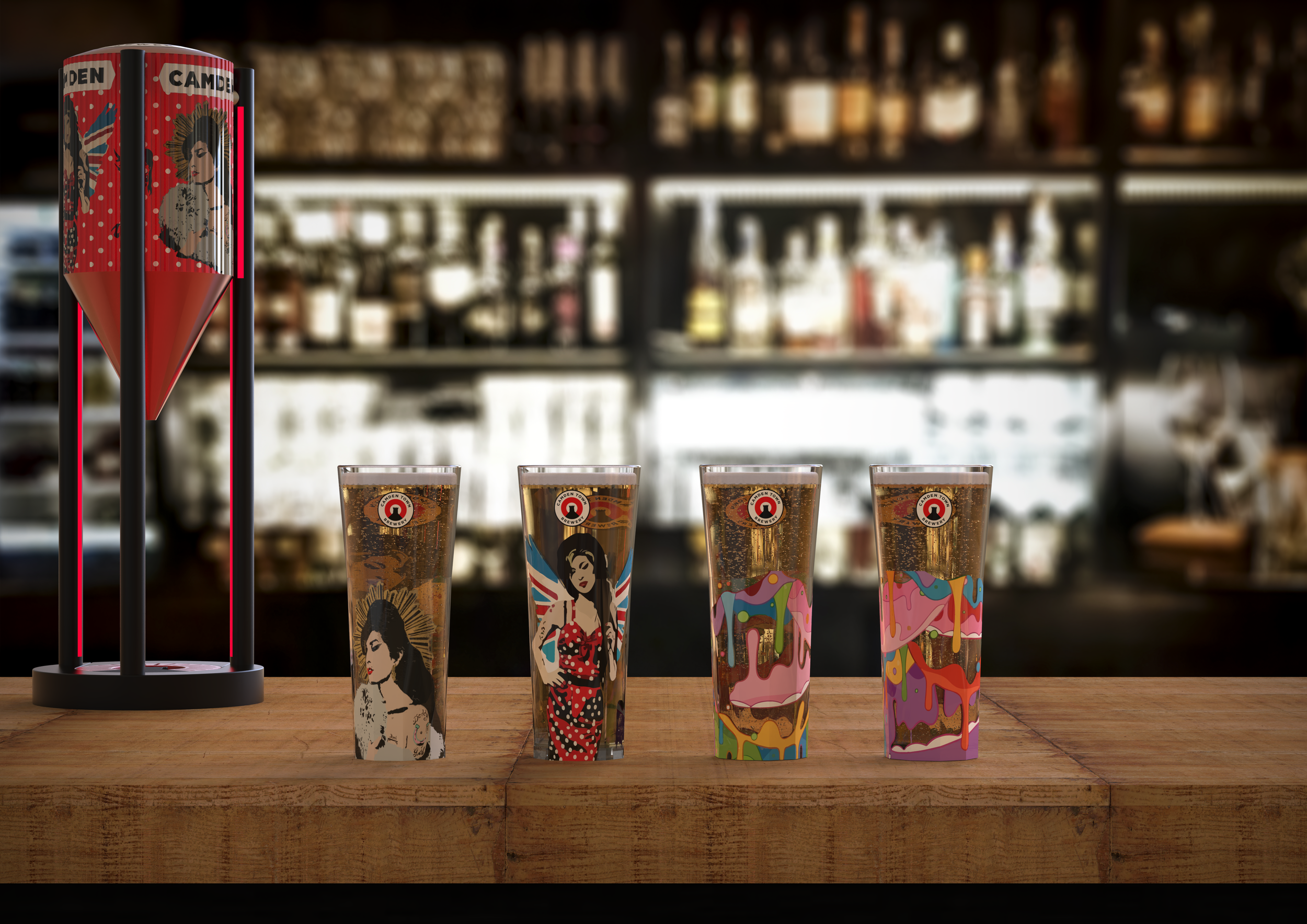
I took inspiration from Camden Town’s brewery and its logo. The main body of the font is cylindrical in form with a concave lid and cone at the bottom. This form was taken from the large tanks used in the brewing process, resembling freshness and beer. I elevated the tank to allow for their signature ‘Kenneth’ glass to take centre stage and be placed within the font itself. This creates customer interaction as it encourages them to grab the glass from the tray. The long black legs were inspired from the ‘Hells’ font design, portraying boldness and strength. The base has an incorporated drip tray displaying the company’s logo in an elegant and clever way. The tower in the tray acts as a glass support and gives it friction, preventing it from sliding off. The arch is the removable drip grill and the entire tray is removable. Overall, the design is bold, original and screams Camden Hells!


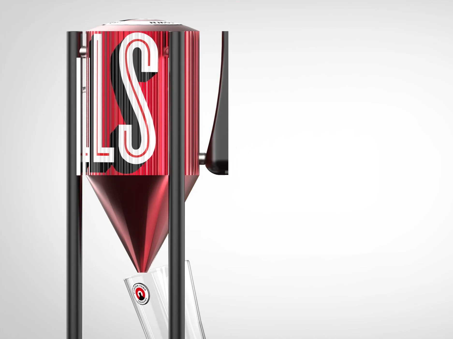


TAP HANDLE EXPLODED VIEW

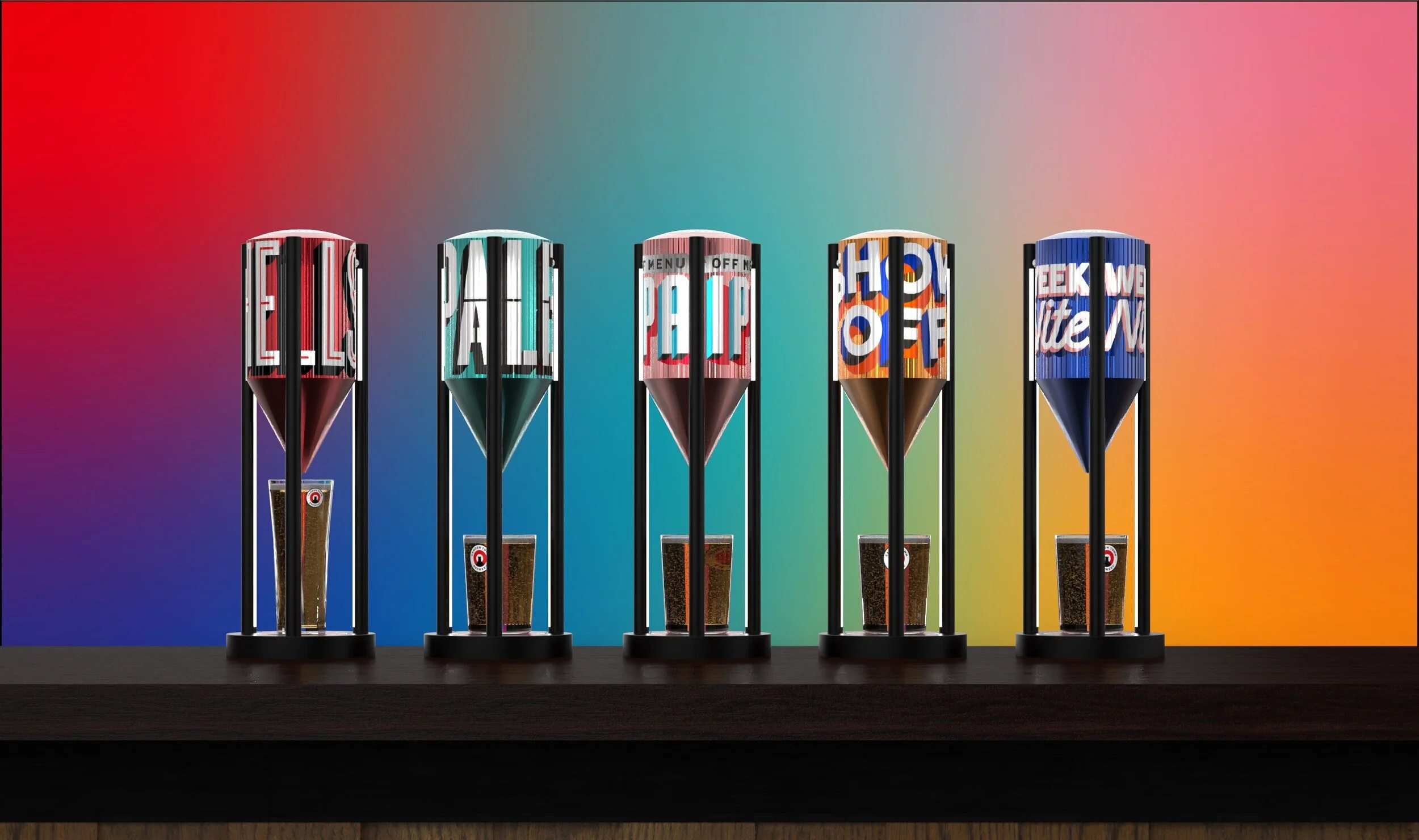
CAMDEN TOWN’S MAIN BEER FONTS RANGE

EXPLODED VIEW
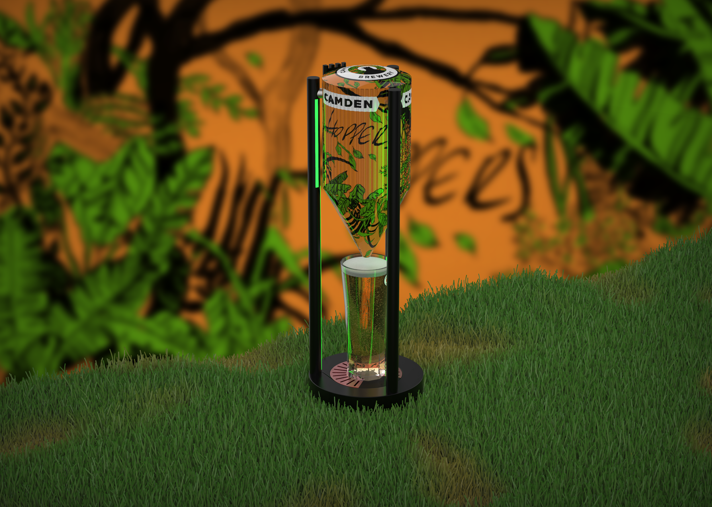
LIMITED EDITIONS & GLASSES
STORYBOARD
MADE TO GRAB!